Is a 24hr energy consumption graph really useful?
I'm somewhat surprised to see how much effort and excitement Google and Microsoft are putting into the ability to show graphs of home energy consumption minute-by-minute from a smart meter. I've had that ability in my house for several years now (not directly measured but a close enough proxy based on knowing which devices are currently on or off). My conclusion after staring at the graph on and off for several years now is that it's really not that interesting!
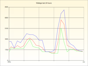
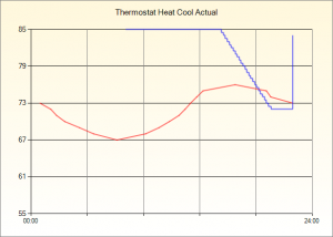
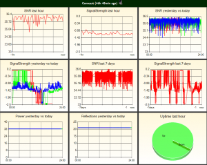
Here's one of my 24 hour graphs showing the peak, minimum and average electricity consumption in five minute intervals during the day. Fascinating huh? So what are you going to do with it?
The fact of the matter is that you still need to take a shower and the
fridge still needs to stay cool - those peaks really aren't interesting.
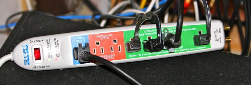
If you do want to see how much energy any device is using you can get
one of the many Wattage Monitoring
Products
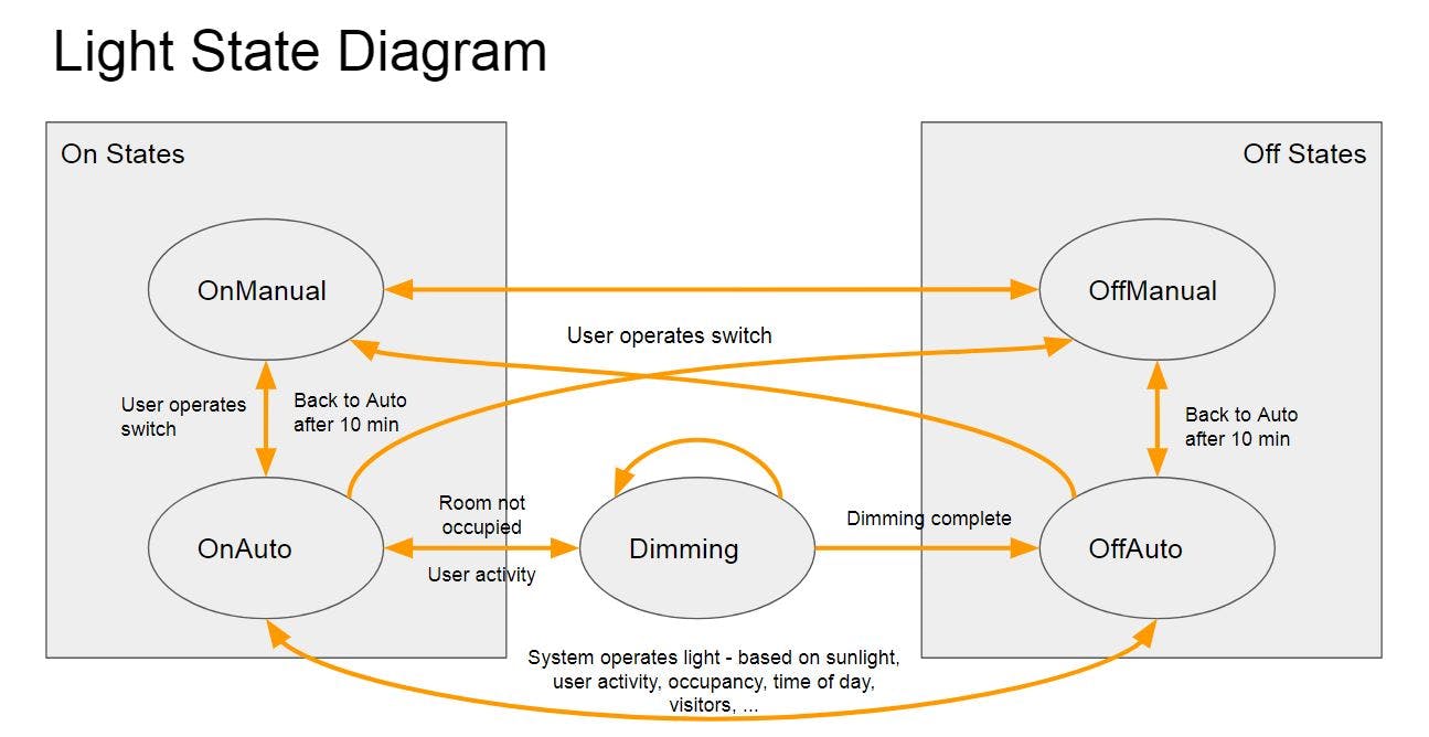
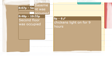
It turns out that the real problem here is the base-load rather than the occasional short-lived peak. Some of that base load is unavoidable but one of the top controllable loads is lights that stay on for hours at a time, so, in your quest to reduce energy consumption, start with them. Replacing them with compact fluorescents or LED lights is an obvious step, but not without drawbacks (lack of dimming, harsher white light, flickering, ...). A better solution is to have a smart home; one that can turn lights off when people aren't in a room, or can lower the brightness according to the time of day. That's what my home automation system does and it has produced some fairly dramatic energy savings as a result: over the past 5 years it now uses 40% less electricity than it used to! Unfortunately most home automation systems aren't smart enough to do this - they will happily plunge you into darkness because you sat still for too long in one room. After years of refinement (both software and hardware) my own system can now accurately assess which rooms are occupied and very rarely does it make a mistake that results in darkness when there should be light. As I mentioned earlier it also prolongs bulb life by running them at less than 100% saving more energy and dramatically reducing how often you need to go up a ladder to change those high-up lights.
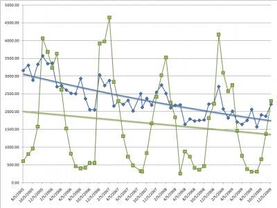
This then is really the graph you want to pay attention to and it's something you can make yourself using the utility bills you get every month. I also think that the energy companies could do more to promote green-envy: simply show people how much less energy their neighbors are using! Shame them into action. Rank them ... "you are #1 in your street for energy conservation". I know some places have started to do something like this but it needs to be widespread.
