Email opt-out: Here is a great example of how to do it right
 I
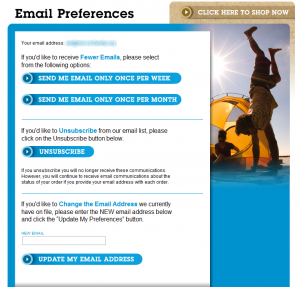
came across this opt-out screen today. It's one of the best examples
I've seen recently of an opt-out screen done right.
I
came across this opt-out screen today. It's one of the best examples
I've seen recently of an opt-out screen done right.
First, they try to fix one of the key reasons people opt out of email: they are still interested but they want less email.
Then they give you the option to really just quit completely.
Then they give you the option to change your email address.
It really looks like they have done their homework, presenting these in the order that most likely applied whilst also trying to keep you as a recipient.
Anyone implementing email notifications for their startup should also take a look at CAN-SPAM.
